Branding and stationery for a startup homeopathic clinic.
Homeopathy is a medical practice dating back to the 1700s. It focuses on the individual, and uses the law of similars with minimal doses to treat patients.
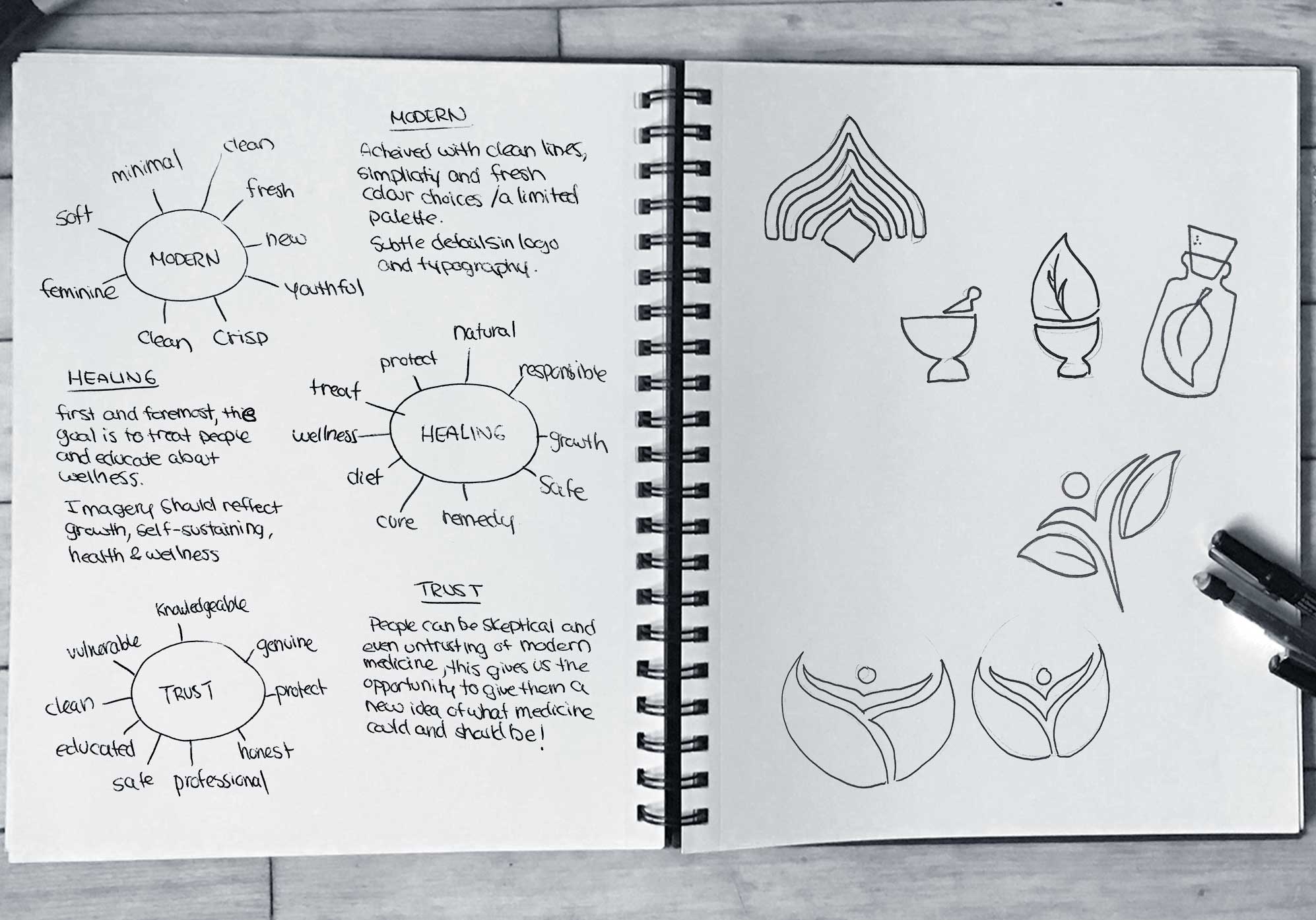
When starting this project I knew that trust had to be prominent in my design. Health care is a sensitive subject for most and, a pillar of homeopathy is vulnerable sections of the population: trauma victims, seniors, pregnant or nursing mothers, and children.
The new brand needed to inspire healing, growth, and the effectiveness of natural remedies.
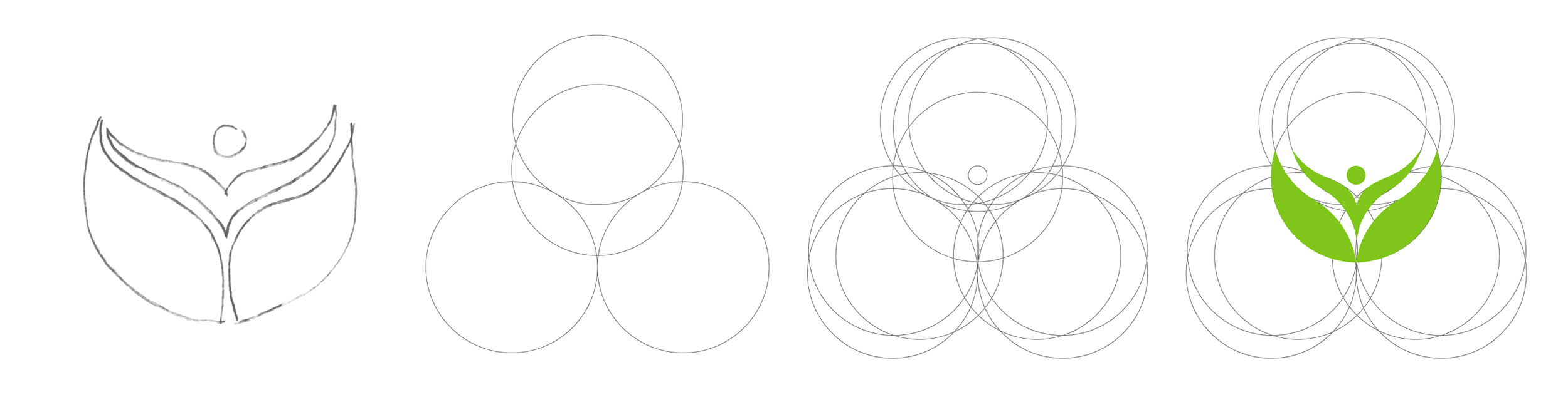

Following the law of similars, I used circles of the same size to create the pictorial of the logo. The shape illustrates an individual emerging from an organic shape. This growth symbolizes prosperity and healing.
The colour green is associated with remedies and pharmacies, it also embodies the all natural properties of homeopathic remedies.
The typeface paired with the pictorial compliments the circles in the illustration. It is a modern version of an otherwise old style, much like Classic Homeopathy.
The symmetry, lowercase type, and soft colours give patients a feeling of comfort, and the trust they should feel when addressing their medical needs.