Mayofest—a music festival in Mayo, Quebec—was in need of a new brand. So they called on their community to help find a new logo and identity.
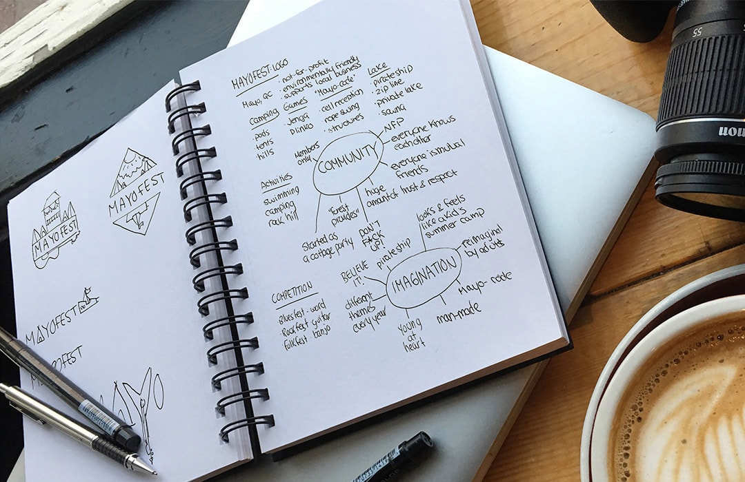
Mayofest is the not-for-profit go-to place for camping, music, and general good times. When they announced they were starting a contest to find a new logo, I couldn't wait to participate and show them what a brand could do for their vision.
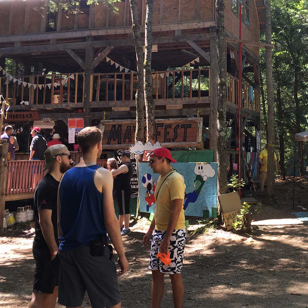
The once cottage party has truly taken on an identity of its own. It’s the most spirited, wild, and welcoming festival myself—and many others—have ever been a part of.
The thing that stands out most is the strong sense of community.
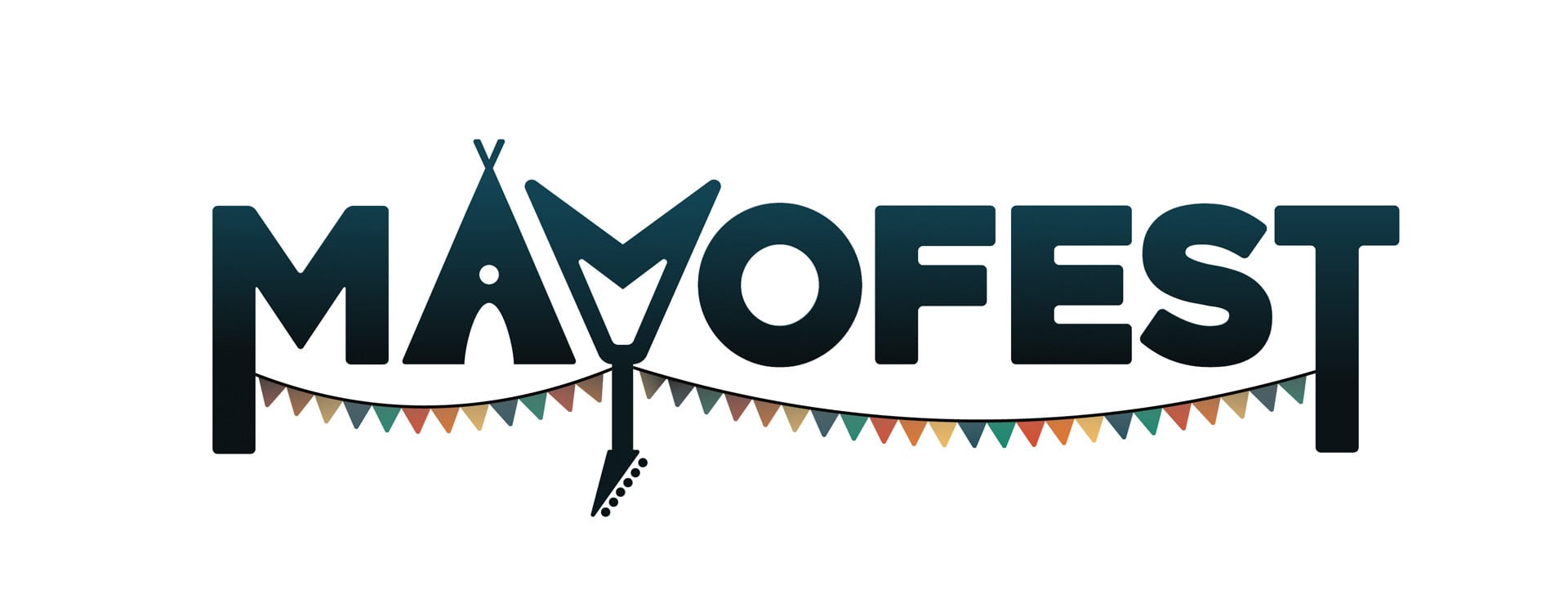
Everything is connected by the pennant banner. This connection shows the sense of community unique to Mayofest. The look is classic to Mayofest, and represents the kind of atmosphere expected at this festive event.
While trying to capture the character of Mayofest, it’s also important viewers know right away what the main attractions are. These are visualized in the A and the Y of the logo, showing a tent and a guitar.
As a not-for-profit, it is important that the brand has a professional appearance for potential investors.
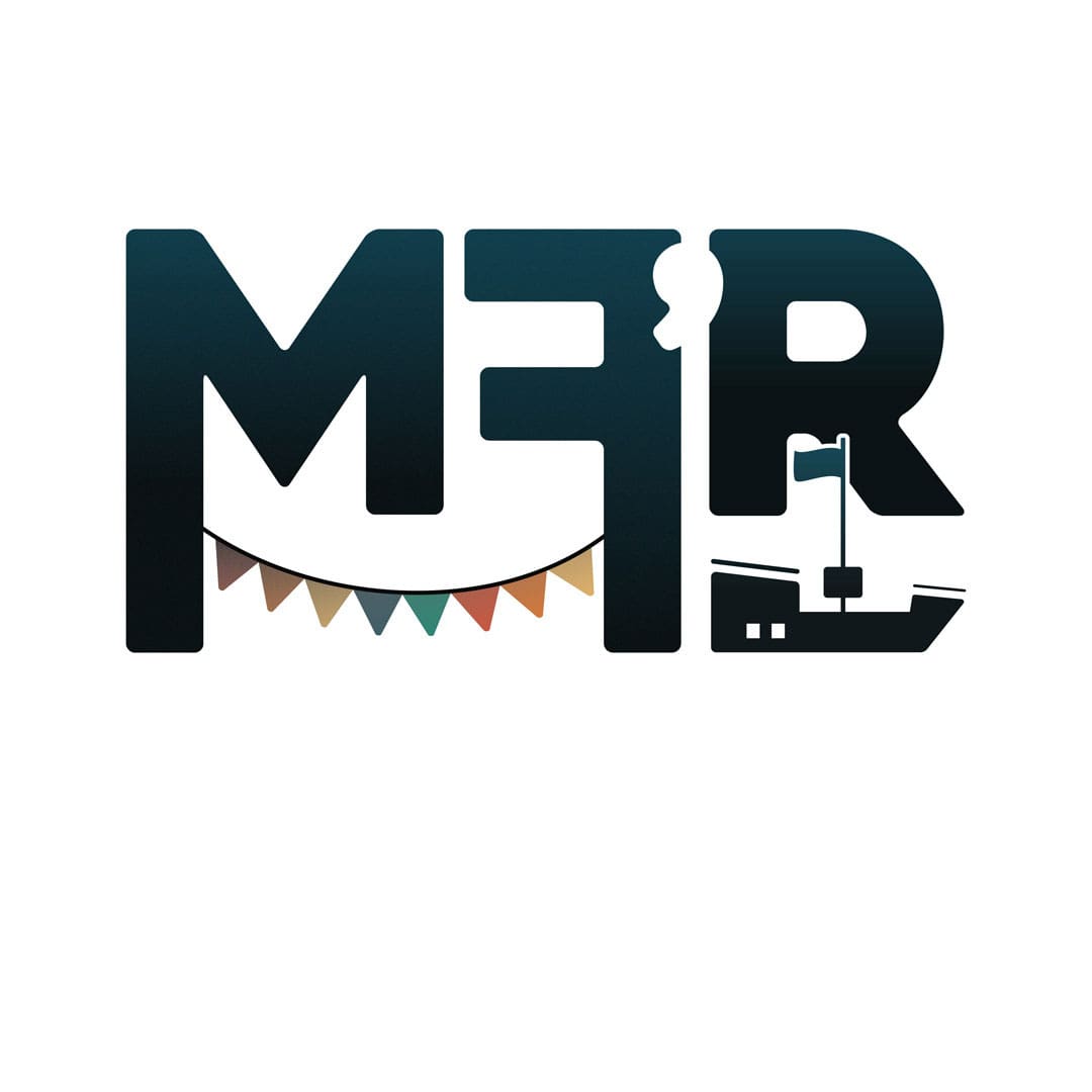
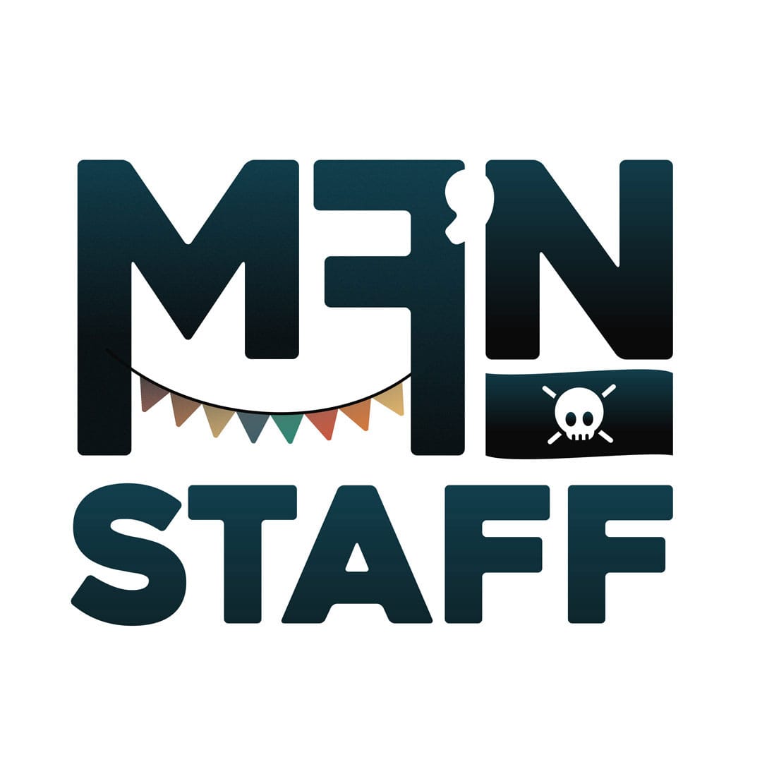
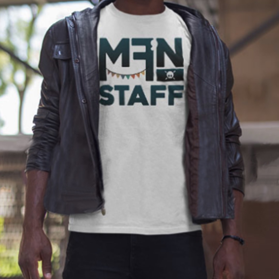
There is a very dedicated community behind Mayofest, and they have a very saucy sense of humour. Many would call it crass, and it's definitely vulgar. Their motto—which is written on staff shirts—is "Don't F#$! up!"
This one of a kind community needed to be represented with the new brand. This is where the inside joke comes in.
These cheeky double entendres cater to the sense of humour that makes Mayofest, and the Mayofesters who attend, unique.
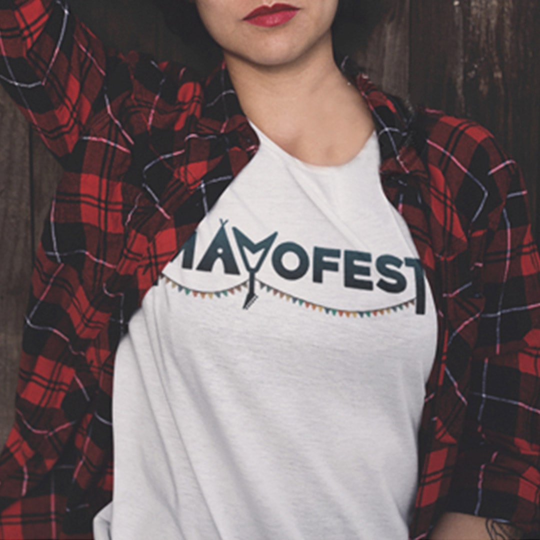
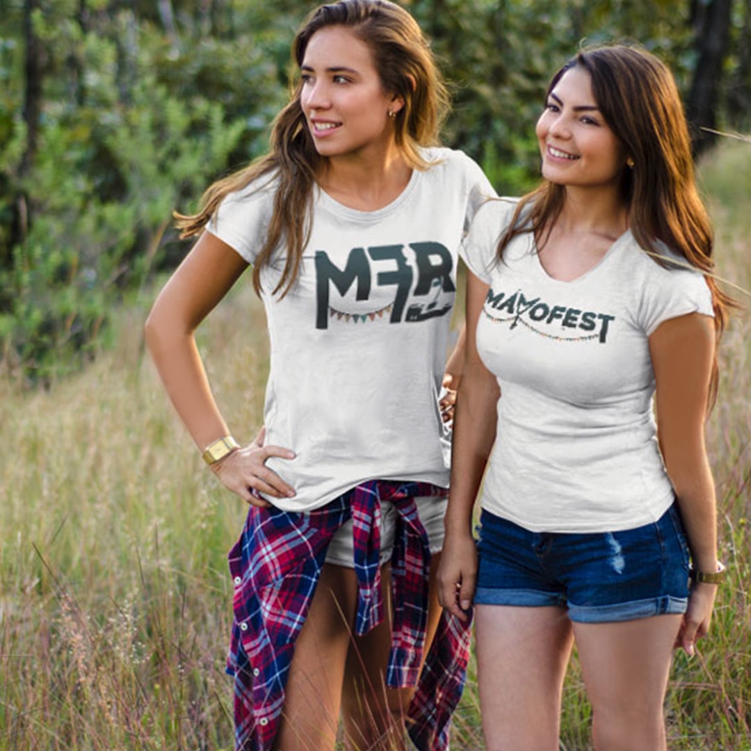
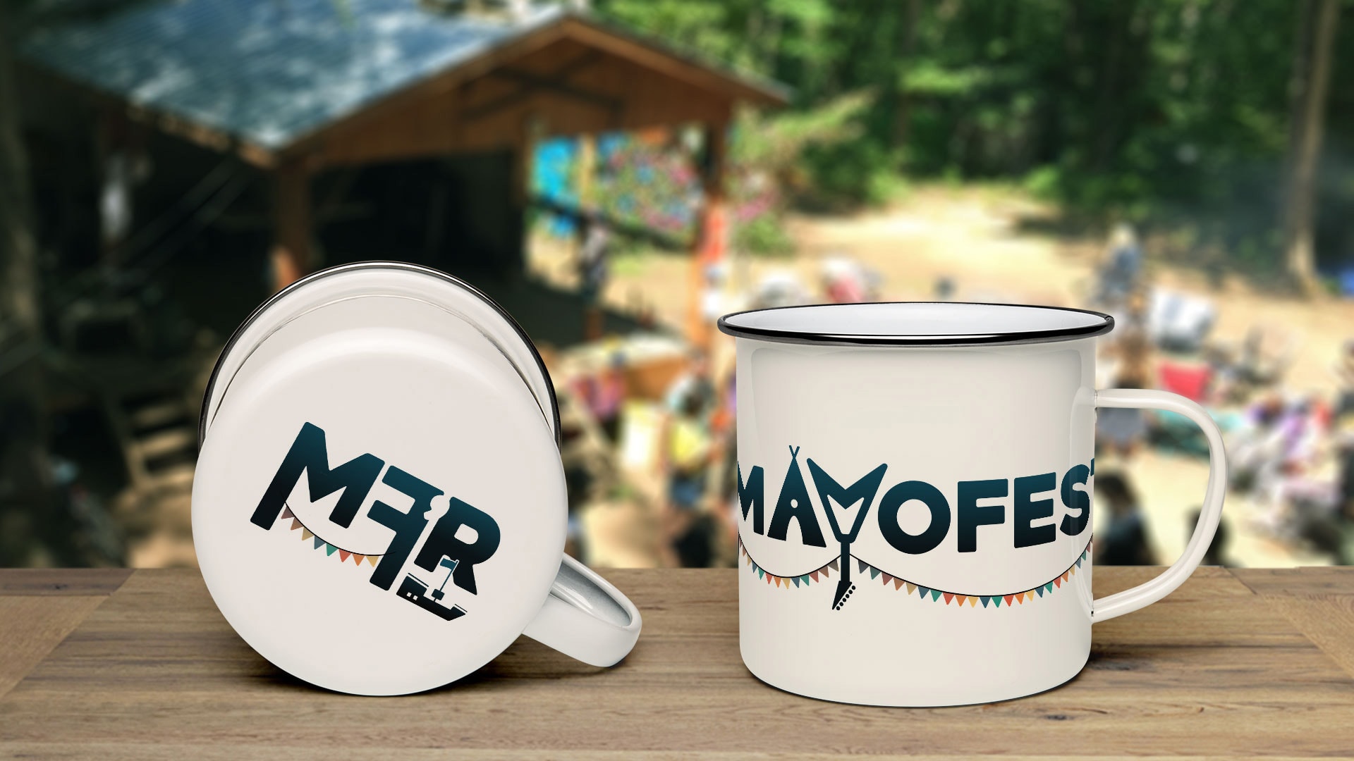
As a not-for-profit, it’s important that the merch is as exciting as the event itself. This way, Mayofest is getting the funds they need to keep expanding.
Since glass isn’t allowed on the grounds and plastic is discouraged, people have to bring their own cups for drinks on the site.
Since Mayofesters are environmentally conscious, the perfect keepsake to any Mayo event would be a reusable camping mug or cup.
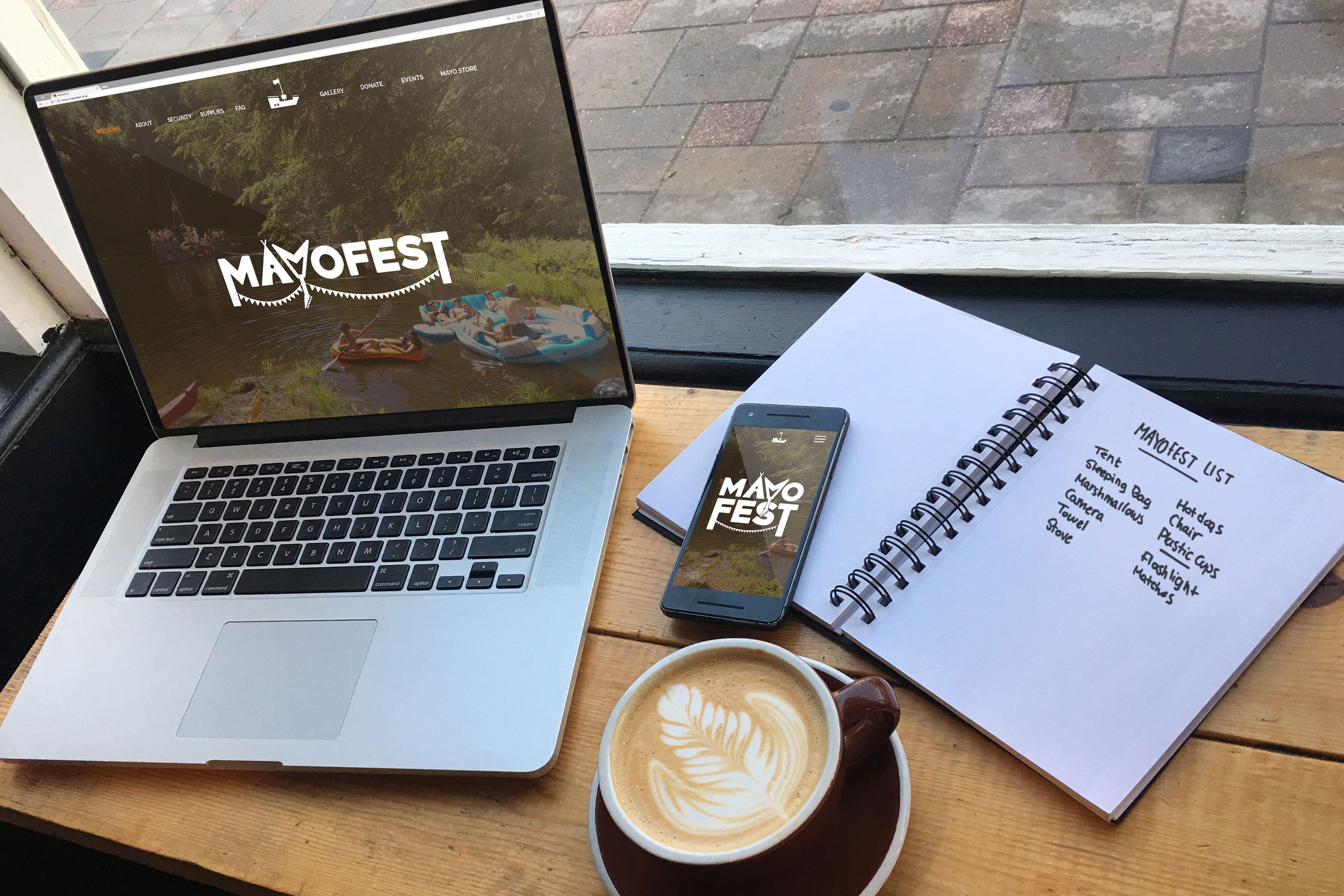
I was overwhelmed and delighted to be the winner of this contest. Mayofest started implementing their new brand right away, you can now find it on their website and all social platforms. Stay tuned for the new merch coming summer 2018!
To view the full branding presentation in a new tab, click the button below for a short PDF presentation.
Full Brand Presentation